A small backyard does something useful: it removes the option of getting away with vagueness.
In a large yard, you can scatter furniture, add a few plants in the wrong places, and the space will still function well enough. Nothing will cohere, but there’s room to not notice.
In a small yard, every decision is visible. A piece of furniture that’s wrong for the proportion reads immediately wrong. A surface material that doesn’t relate to anything else looks isolated. One busy element is too many.
That pressure is exactly what good small outdoor room design uses to its advantage. Constraint forces editing. Editing is what makes a space read as considered rather than accumulated.
Start with the floor, not the furniture
The surface of an outdoor room sets the room’s geometry before anything else does. Lawn says “not yet decided.” Gravel, pavers, or a defined deck say “this is the room.”
Define the outdoor room’s footprint first. Even in a small space (8 by 10 feet, 12 by 14) mark out a clear zone with a material boundary: gravel with metal edging, pavers with a contrasting border, or a deck section with a clear perimeter rail or edge.
A room reads cramped less because of its size than because of where the eye stops.
The boundary makes the room. Without it, a small backyard is furniture sitting on lawn. With it, the furniture is in a room.
Stick to one or two surface materials. Limestone and gravel. Teak decking and concrete paver borders. The coherence of the floor is visible from inside the house and from any point in the space. It’s the first read, before the furniture.
Proportion over quantity
The furniture instinct in a small outdoor room is to fit in as much as possible. That instinct makes the space read as small.
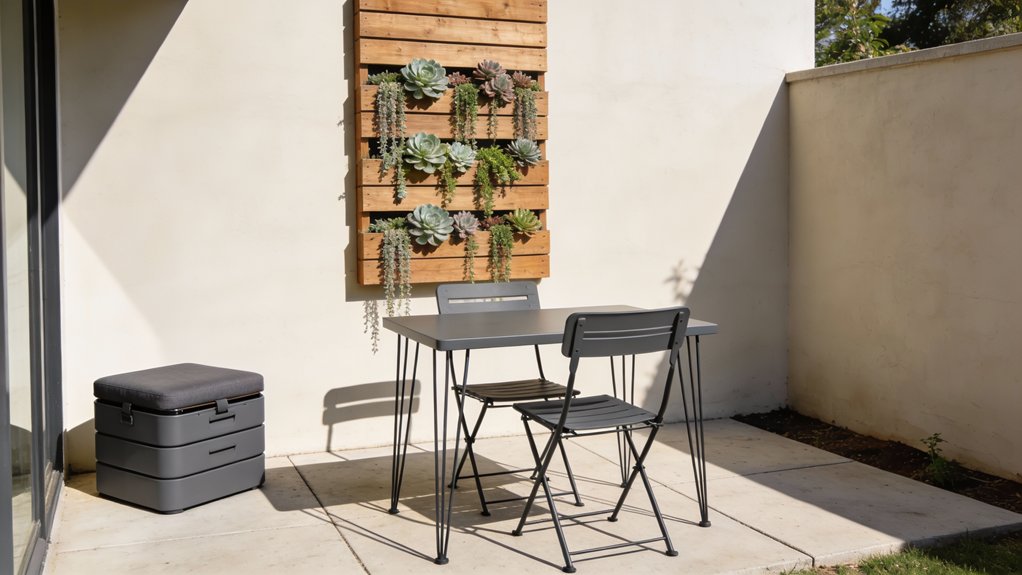
A bistro table and two good chairs take up less visual space than a four-seat dining set, but they also leave room for the room to breathe. That breathing space is not wasted; it’s what makes the eye read the space as larger than it is.
Choose one use and commit to it. Dining or lounging. Not both. A small outdoor room that tries to do everything ends up doing nothing well.
If the primary use is morning coffee and reading, the right furniture is two chairs, a small side table, and clear floor space around them. If the primary use is evening dining, a compact bistro table and two chairs serves two people better than a padded lounge set does four.
Taste is a set of repeatable choices, not a gift you either have or don’t. Choosing less is a choice most small backyard rooms need to make.
Vertical structure as a space-making tool
A small backyard reads most constrained when it’s flat: low furniture, flat surface, lawn or gravel to the fence.
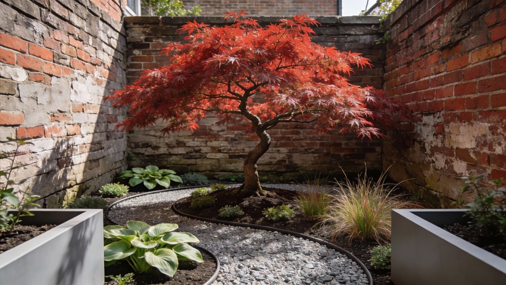
Adding height changes the room’s register. A pergola frame overhead creates the ceiling that makes the outdoor room feel like a room. A tall planted screen along one edge gives the space a back wall. A wall planter at fence height brings planting into the visual plane instead of letting it disappear at ankle level.
These vertical elements don’t eat floor space. They redefine the room’s volume.
A narrow planter box set against a fence (10 to 12 inches deep, full-width) can hold an espalier, climbing herbs, or a structured hedge and cost less than a single piece of outdoor furniture. It turns a fence from a boundary into a wall.
The one focal point rule
A small outdoor room with two focal points has no focal point.
Choose one element that the seating orients toward. A fire pit, a planted urn, a wall-mounted water feature, a sculptural pot, a well-chosen piece of art. Something that gives the eye a destination and the seating a reason to face inward.
Everything else should support that choice, not compete with it. If the focal point is a fire pit, the planting should frame it rather than draw attention away. If it’s a large planted urn, the furniture should be quieter in color and material.
This is the same principle as any designed interior: rooms work when they have hierarchy. One thing matters most; the rest is arranged to support it.
Material coherence at small scale
In a large yard, a mix of materials can look eclectic. In a small one, it reads as unresolved.
One material family, repeated consistently. Natural wood and terracotta and stone belong together. Powder-coated metal and concrete and engineered stone belong together. Either one, held consistently across the outdoor room’s furniture, planters, and edging, reads as a decision. Mixed, they suggest the space was assembled without a guiding eye.
Cushion color follows the same principle. A single color or a tight tonal range (two shades of the same color) reads as designed. Three different cushion colors in a small space compete for attention on a surface where everything is already close together.
The sightline from inside
The small outdoor room is almost always visible from inside the house. That’s an asset, not just a logistical fact.
Design the outdoor room to look composed from the most common interior view, typically the kitchen window or a glass sliding door.
That means: clear geometry at the floor plane, at least one tall element that gives the view depth, and a color story that doesn’t clash with the interior palette. A warm-toned outdoor room visible through a glass door reads as an extension of the house. A visual mismatch makes both spaces look less considered.
You can make an ordinary outdoor room look considered without a designer’s budget. In a small backyard, the budget constraint and the space constraint are working in the same direction: both force you toward the fewer, sharper choices that make a space actually read well.