Picture the same kitchen twice. Same layout, same counters, same boxes on the wall.
In the first, the cabinets are one flat builder color top to bottom, with the little round knobs that came with the house. It reads as dated.
In the second, the lower cabinets are a deep color, the uppers stay light, and the handles are longer and quietly better. It reads as designed.
Nothing structural changed between those two kitchens. What changed was contrast and hardware. Both are cheap, and both do far more than the surface they cover.
Why a flat kitchen reads as dated
A kitchen where everything is one tone has no hierarchy. Your eye has nowhere to land, so the whole wall flattens into a single dated block.
That flatness is the actual problem. Not the year the cabinets were installed, not the door style, not the brand. A kitchen looks old mostly because it has no intentional contrast, and “no contrast” is what every builder-grade install ships with.
You don’t need to replace the cabinets. Paint the lowers a deep color, leave the uppers light, and the kitchen suddenly looks designed instead of dated.
Designers reach for this on purpose. Grounding the bottom and lifting the top gives the room weight where it should be heavy and air where it should be light. It’s the same instinct as dark shoes with a light shirt.
The two-tone move, done right
This is the part you can do with two cans of paint and a free weekend. The trick is which way the contrast runs.
- Dark on the bottom, light on top. Deep color on the base cabinets anchors the room; keeping the uppers light keeps the wall from closing in. Flip it and the kitchen feels top-heavy and smaller.
- Pick a deep color with a clear undertone, not muddy almost-black. A forest green, a navy, a warm charcoal, all read as a decision. A vague dark gray reads as a mistake.
- Leave the uppers close to the wall color so they recede and the room breathes.
- Carry the dark onto an island if you have one, so the floor color has a partner and the scheme looks planned rather than accidental.
Use a proper cabinet or trim paint and degrease the doors first. The paint is cheap; the prep is what makes it look like cabinetry instead of a coat over grease.
The cheapest change that reads as ‘designed’ beats the expensive one that reads as ‘renovated’.
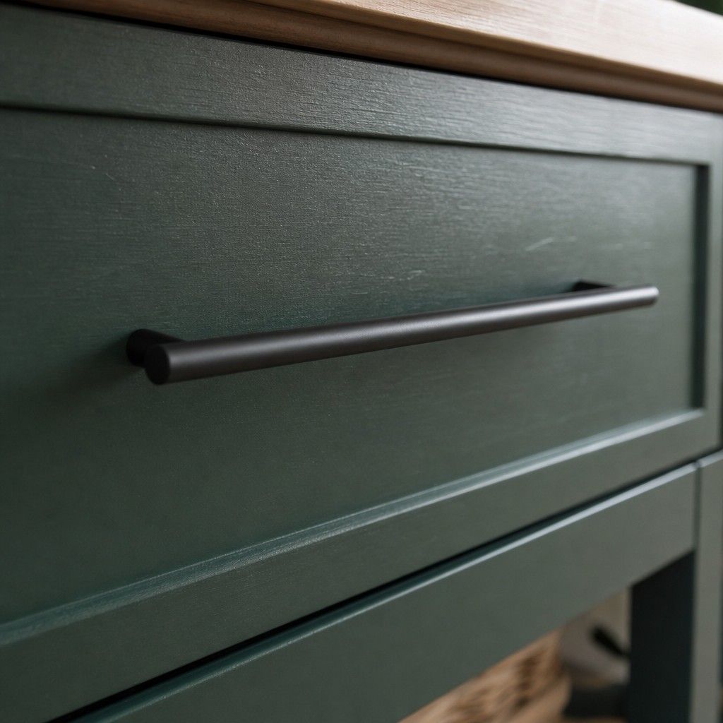
Hardware is the jewelry, and it’s doing more than you think
Swap nothing else and new handles still shift a kitchen. Hardware is the one thing your hand touches every day and your eye reads as a finish detail, so cheap dated knobs quietly age everything around them.
The fix is mostly about scale and consistency.
- Go longer on the drawers. A long bar pull across a wide drawer looks current; a single small knob marooned in the middle looks builder-default. Match the pull length roughly to the drawer width.
- Pick one finish and commit. Matte black, brushed brass, or warm nickel across every door and drawer. Mixed leftover hardware is the fastest tell that a kitchen was never really designed.
- Use knobs on doors, pulls on drawers, the standard split, so the layout looks deliberate instead of random.
- Reuse the existing screw holes where you can. Pulls sized to the existing hole spacing save you filling and redrilling, which keeps the whole job to an afternoon.
A full set of decent pulls for an average kitchen is the price of a modest dinner out. It’s the highest return per dollar in the room.
Sequence it so the cost stays tiny
Order matters, because the right order keeps you from buying things you don’t need.
Paint first, live with it for a few days, then choose hardware against the new color. Brass pops against a deep green it would have disappeared on; black grounds a navy that brass would have fought. Choosing the metal before the paint dries is how people end up with a third can and a second hardware order.
Done in that sequence, the entire change is two tins and one set of pulls. No new boxes, no new counters, no contractor.
The takeaway
A dated kitchen is usually a contrast problem wearing a renovation-shaped worry.
Add intentional contrast with two-tone cabinets, then update the hardware to match. That’s a deep can, a light can, and a set of pulls, against a kitchen that suddenly looks like someone designed it.
Work with the house you have, including the parts you can’t change. The boxes stay. The way the room reads does not.